Master the Charts, Master the Market: Your Complete Guide to the Top Forex Charts Every Trader Must Know

Why Reading Forex Charts Is the Skill That Separates Winners From the Rest
Every single trade you place in the forex market starts with one thing: a chart. Whether you are brand new to currency trading or you have been navigating the markets for years, your ability to read, interpret, and act on forex charts determines how consistently you profit. It really is that fundamental.
At FxTsignals.com, we work with thousands of traders — from complete beginners who have never placed a live trade, to seasoned professionals managing significant capital. The one pattern we notice across the board? Traders who deeply understand forex chart types make sharper decisions, manage risk better, and hold their nerves when markets get choppy.
In this guide, we are going to break down the three most popular forex charts — candlestick charts, bar charts, and line charts — in plain, practical language. No jargon overload. No unnecessary complexity. Just the real, actionable knowledge you need to start using these tools confidently today.
Candlestick Charts: The Trader's Favourite Window Into the Market
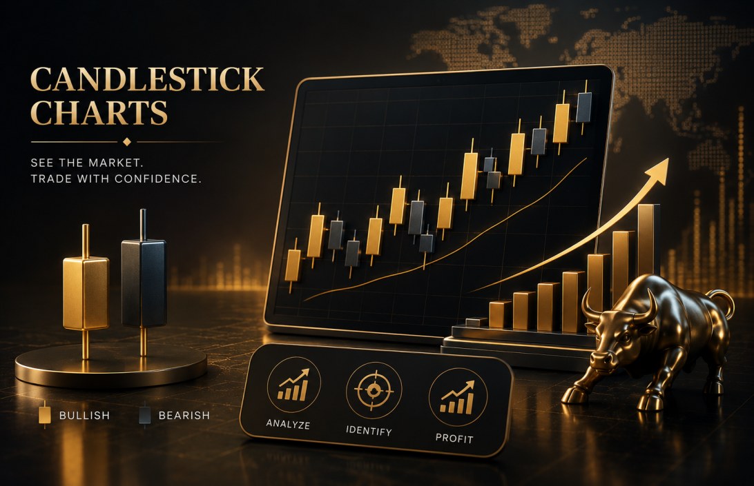
What Exactly Is a Candlestick Chart?
Originating in 18th-century Japan — where rice merchants used them to track commodity prices — candlestick charts are the most widely used forex chart type in the world today. And for good reason. Each individual "candle" on the chart tells a complete story about what the market did during a specific timeframe.
A single candlestick captures four critical price points: the open, the close, the high, and the low. The thick central block (called the "body") shows the distance between opening and closing price. The thin lines extending above and below (called "wicks" or "shadows") show how far the price stretched in either direction before settling.
A green (or white) candle tells you the market closed higher than it opened — buyers were in control. A red (or black) candle means the market closed lower — sellers dominated. One glance at a candlestick chart and you immediately know who won the battle between buyers and sellers in any given period.
The Three Candlestick Patterns Every Forex Trader Should Recognize
Beyond individual candles, certain formations — called "patterns" — signal high-probability trading opportunities. Here are the three you should learn first:
Open and close prices are almost identical. The market is undecided. Often signals an incoming reversal, especially after a strong trend.
Small body at the top, long lower wick. Buyers pushed back hard against sellers. A bullish reversal signal after a downtrend.
Small body at the bottom, long upper wick. Sellers rejected higher prices. A bearish reversal signal after an uptrend.
Mastering a handful of candlestick patterns is worth more than memorising a hundred technical indicators. Patterns reveal psychology — and markets are, at their core, driven entirely by human emotion.
Actionable Tips for Using Candlestick Charts
- Always look for pattern confirmation — one candle alone is rarely enough. Wait for the next candle to confirm the direction before entering.
- Use candlestick signals in combination with support and resistance levels for significantly higher accuracy.
- Higher timeframes (4H, Daily) produce more reliable candlestick signals than lower ones (1M, 5M).
- Volume confirmation makes candlestick patterns far more powerful — high volume on a reversal candle carries more weight.
Bar Charts: The Classic OHLC Approach Professionals Still Rely On
Understanding the Bar Chart Structure
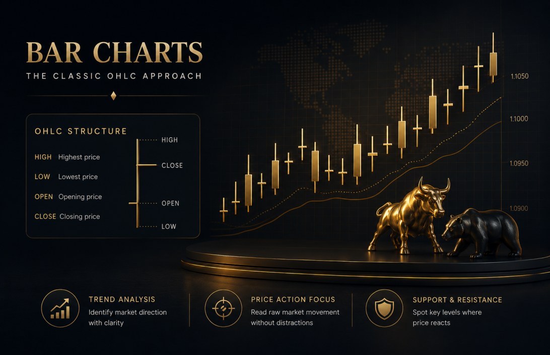
Bar charts — officially known as OHLC charts (Open, High, Low, Close) — have been a cornerstone of technical analysis long before digital trading platforms existed. While they display the same four price points as candlestick charts, they present the information differently: a vertical line shows the full price range (high to low), a small horizontal tick pointing left marks the open price, and a tick pointing right marks the close.
Some experienced traders actually prefer bar charts over candlesticks. Why? Because the absence of the coloured body forces you to read the raw price action more carefully — which can actually sharpen your analytical thinking over time. It is a more stripped-back view of the market, and many professional traders appreciate exactly that.
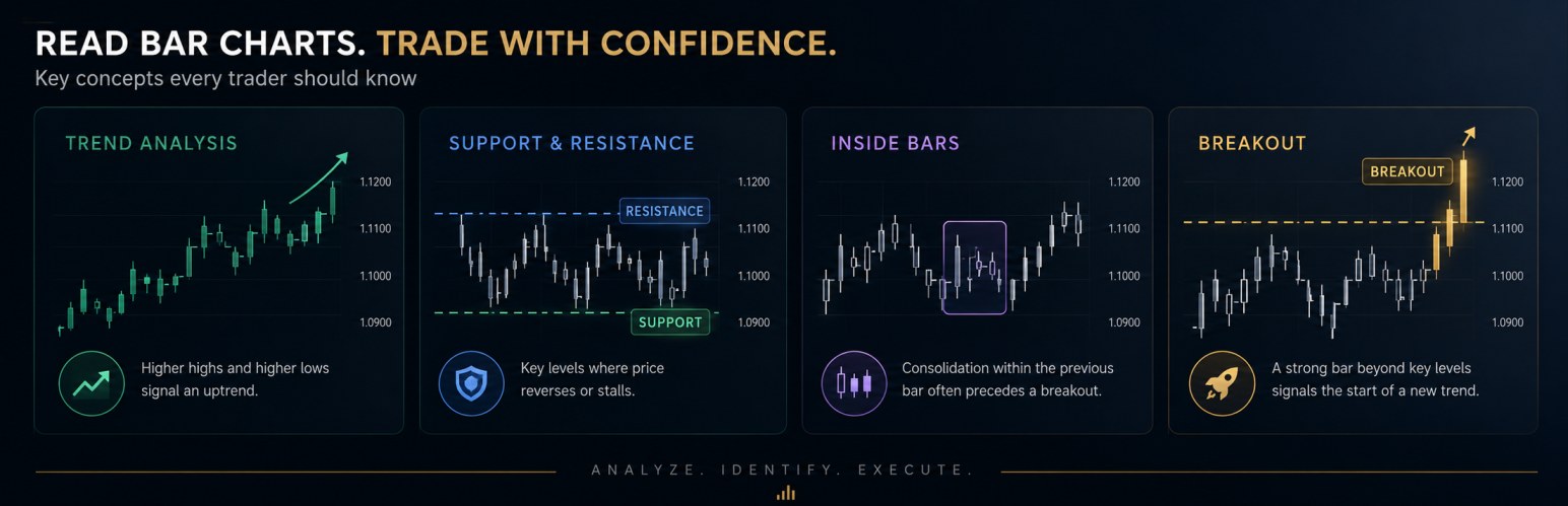
How to Read and Interpret Bar Charts Effectively
The most important skill with bar charts is comparing consecutive bars. When you see a series of bars with progressively higher highs and higher lows, you are looking at an uptrend. The reverse — lower highs and lower lows — signals a downtrend. Beyond trend direction, bar charts are excellent for spotting:
- Support and Resistance Levels: Price levels where bars consistently reverse or stall reveal key market boundaries worth trading around.
- Inside Bars: When a bar's high and low are completely contained within the previous bar, it signals consolidation and often precedes a sharp breakout.
- Wide-Range Bars: An unusually tall bar — with a large distance between high and low — often indicates a major shift in market sentiment or a significant news event.
- Price Breakouts: When price bursts above a previous high with a strong, decisive bar, it can signal the beginning of a new trend worth riding.
Bar charts strip away the visual noise and put the focus squarely on price action. For traders who want a disciplined, technical approach — they are genuinely hard to beat.
Line Charts: The Cleaner View That Still Has a Place in Your Trading Toolkit
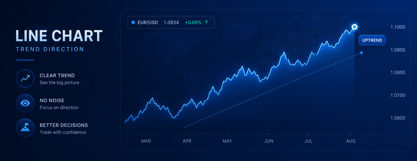
The Simplest Chart, Seriously Underrated
Line charts are the most basic forex chart type — and that simplicity is precisely their strength. A line chart simply connects each period's closing price with a straight line, creating a smooth visual path across time. You lose the open, high, and low data points, but you gain something valuable in return: clarity.
When you want to step back and assess the big picture — to see where a currency pair has genuinely come from and where the dominant trend is heading — a line chart cuts through the noise of individual candles or bars. It is the chart equivalent of taking the 30,000-foot view.
When to Use Line Charts in Your Trading Strategy
Line charts are not suited for precision entry and exit timing, but they genuinely excel in several specific situations:
- Trend Identification: Quickly identify whether a market is in a clear uptrend, downtrend, or sideways range without the visual complexity of candlesticks.
- Drawing Clean Trend Lines: Because line charts only use closing prices, trend lines drawn on them tend to be more reliable and less subject to "wick noise."
- Multi-Pair Comparison: Line charts make it easy to overlay multiple currency pairs on one chart to compare relative performance — invaluable for currency strength analysis.
- Beginner Learning Tool: If you are new to forex, starting with line charts helps you understand basic trend concepts before adding the complexity of candlestick or bar chart analysis.
Never dismiss the line chart as "too simple." Some of the most consistent traders use it as their primary trend filter — and only switch to candlesticks once the trend is confirmed.
So Which Forex Chart Should You Actually Use?
Here is the honest answer: the right chart depends entirely on what you are trying to do in that specific moment. Experienced traders do not limit themselves to a single chart type. They use different charts for different purposes — and knowing when to use which is a skill in itself.
A practical approach many successful traders use: start your analysis session with a line chart on a high timeframe (weekly or monthly) to establish trend bias. Then drop down to a bar or candlestick chart on the daily or 4-hour to identify key support and resistance levels. Finally, zoom into a candlestick chart on the 1-hour or 15-minute to time your actual entry with precision. This layered, top-down approach uses all three chart types — each for what it does best.
Your Charts Are Only as Powerful as the Trader Reading Them
Forex charts are not magical tools that guarantee profits. They are frameworks — structured ways of organising raw price data so that the human mind can find patterns, assess risk, and make probabilistic decisions. Candlestick charts give you the deepest insight into short-term sentiment and potential reversals. Bar charts offer a clean, professional-grade view of price structure. Line charts provide the clearest possible picture of the dominant trend.
The traders who succeed long-term are not necessarily the ones who know the most indicators or use the most complicated strategies. They are the traders who develop a deep, intuitive understanding of price action — and that journey begins with understanding these three foundational chart types.
Study them. Practice reading them. Apply them to real markets with a demo account before risking capital. And keep coming back to FxTsignals.com — because we are here to provide the signals, education, and community you need to trade smarter, not harder.
Frequently Asked Questions
Join thousands of traders at FxTsignals.com who combine expert chart analysis with our real-time trading signals to find better setups, manage risk smarter, and trade with genuine confidence.