How to Read Forex Charts Like a Pro:
The Complete Trader's Guide
Unlock the secrets hidden inside every price bar. From candlestick patterns to support levels — this guide gives you everything you need to trade with confidence.
Why Forex Charts Are Your Most Powerful Trading Tool
Every professional Forex trader has one thing in common — they understand charts. Not just glance at them, but truly read them, the way a navigator reads a map in the middle of a storm. If you've ever stared at a chart and felt completely lost, this guide is specifically written for you.
Forex charts are graphical representations of price movements in the foreign exchange market. At first glance, they can look overwhelming — a jungle of candles, lines, and indicators. But once you understand what each element means, patterns emerge that tell a very clear story about where price has been and, more importantly, where it might go next.
In this comprehensive guide, we'll walk you through everything from the three core chart types to advanced concepts like support and resistance, chart patterns, and technical indicators — all explained in plain English, with real-world examples and actionable tips you can apply immediately on your trading platform.
"Forex charts are the roadmaps to profitable trading. Master the map, and the market becomes far less of a mystery."
The Three Types of Forex Charts Every Trader Must Know
Before you can read a chart, you need to pick the right one. Each chart type presents the same price data differently, and choosing the right format can significantly impact how quickly you spot opportunities. Here's a clear breakdown.
Line Charts
The simplest of the three, line charts connect closing prices with a single continuous line. They strip away the noise and give you the clearest view of the overall direction. If you want to see whether a currency pair has been trending upward or downward over the past month, a line chart shows that in seconds.
Best for: Identifying long-term trends, clean visual analysis, beginner-friendly reading.
Bar Charts
Bar charts display four data points for every time period: the Open, High, Low, and Close prices (often called OHLC). Each bar looks like a small vertical line with two horizontal ticks — the left tick shows where price opened, the right where it closed. The vertical range shows the full high-to-low movement.
Best for: Assessing short-term price fluctuations and identifying significant price levels.
Candlestick Charts
By far the most popular choice among professional traders, candlestick charts display the same OHLC data but in a visually intuitive format. Each "candle" has a thick body (the range between open and close) and thin wicks above and below. Green candles indicate bullish price action; red candles show bearish movement.
Best for: Reading market sentiment, spotting reversal patterns, and making precise entry and exit decisions.
Start with candlestick charts. The visual clarity they provide — especially when you learn to recognize key patterns like the Doji, Engulfing, or Morning Star — gives you a genuine trading edge that line and bar charts simply cannot match.
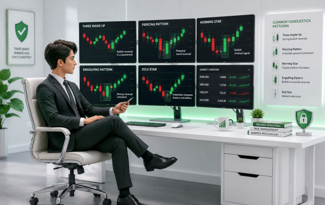
Reading Candlestick Patterns at a Glance
The image shows some of the most commonly traded candlestick formations. Each pattern tells a specific story about the battle between buyers and sellers during that time period.
- Three Inside Up — a strong bullish reversal signal
- Piercing Pattern — indicates potential upward momentum
- Morning Star — classic bottoming formation
- Engulfing Pattern — one candle fully consumes the previous
- Doji Star — perfect indecision between buyers and sellers
Key Components of a Forex Chart — Explained Simply
Every Forex chart is built from the same fundamental building blocks. Understanding what each element represents is essential before you start analyzing price action or making trading decisions.
The Price Axis (Y-Axis)
Running vertically along the right side of any chart, the price axis shows you the exact value of a currency pair at any given point in time. As price moves up the chart, the pair is gaining value; as it moves down, it's losing value.
The Time Axis (X-Axis)
The horizontal axis represents time. Moving from left to right, you're moving forward through time. Charts can be viewed in any timeframe — from a 1-minute chart showing seconds of activity to a monthly chart spanning years.
Timeframe Selection
This is one of the most important decisions a trader makes. Short-term traders work on 1-minute to 15-minute charts. Swing traders prefer 4-hour and daily charts. Long-term investors rely on weekly and monthly views.
Technical Indicators
Overlaid on top of raw price data, technical indicators are mathematical calculations that help traders confirm trends, identify momentum, and generate trade signals. Key examples include moving averages, RSI, and MACD.
Volume (Where Available)
Volume tells you how many trades occurred during a given period. High volume on a breakout confirms strength; low volume on a move suggests weakness or potential reversal — a significant advantage for traders who have access to it.
Currency Pair Label
The top of every chart displays the currency pair being analyzed (e.g., EUR/USD, GBP/JPY) along with the selected timeframe. Always double-check this before placing a trade — costly mistakes have been made from mixing up charts.
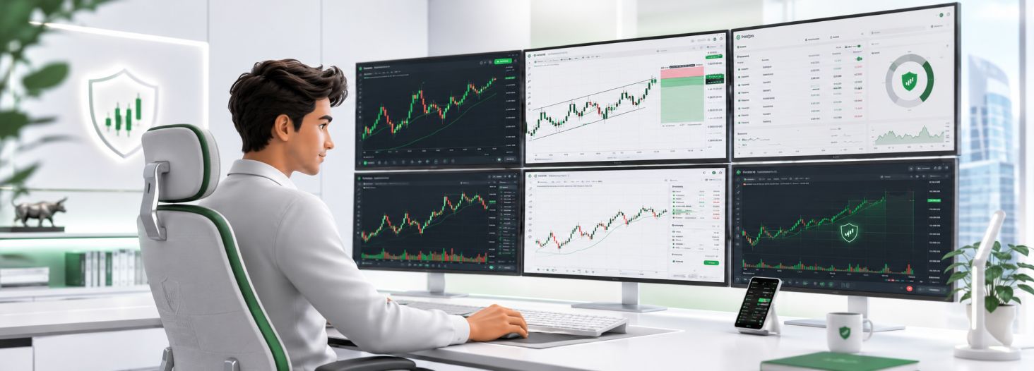
Understanding Timeframes in Action
The chart interface demonstrates a multi-timeframe trading setup — exactly the kind of view professional traders use daily. Notice how different timeframes on the same pair can show seemingly contradictory information.
This is why experienced traders always analyze the "higher timeframe" first to understand the macro trend, then drop to a lower timeframe to fine-tune their entry. This multi-timeframe approach dramatically improves timing and reduces false signals.
Use the 4-hour chart to determine the trend direction, then switch to the 1-hour or 15-minute chart to find your precise entry point. This two-step approach is used by most successful Forex traders at every level.

How to Read Forex Charts — Identifying Trends and Patterns
Reading a chart is both a science and an art. The science is in understanding the definitions — uptrends, downtrends, support levels, chart patterns. The art is in applying that knowledge in real market conditions, where nothing is ever perfectly textbook.
Identifying Market Trends
Trends are the foundation of profitable trading. The oldest and most repeated rule in Forex is "the trend is your friend" — and for good reason. Trading in the direction of the prevailing trend dramatically increases your probability of success.
Uptrend
An uptrend forms when price makes a series of higher highs and higher lows. Each new price peak is higher than the last, and each pullback ends at a higher level than the previous pullback. Draw an ascending trendline connecting the higher lows to identify it clearly.
Downtrend
The opposite is true for a downtrend — price forms lower highs and lower lows. A descending trendline connects the lower highs and helps you visualize the strength and angle of the downward move.
Sideways (Range-Bound)
When neither buyers nor sellers are in clear control, price moves horizontally between two roughly equal levels. In a range, traders look to buy near the bottom and sell near the top — or wait patiently for the breakout that signals the next trend.

Common Chart Patterns Every Trader Should Recognize
Chart patterns are recurring formations in price action that tend to signal either a continuation of the existing trend or a reversal. These patterns have been observed and documented over decades across all markets, and they remain highly relevant in Forex trading today.
Head & Shoulders
This three-peak formation has a tall center peak (the head) flanked by two shorter peaks (the shoulders). It signals that a bullish trend is likely exhausted and a bearish reversal is imminent. The "neckline" — drawn connecting the two valleys between the peaks — is the key level to watch. A close below it confirms the pattern.
Double Top / Double Bottom
A Double Top forms when price hits a resistance level twice and fails to break above it, signaling a potential reversal downward. Its mirror image, the Double Bottom, occurs when price tests a support level twice without breaking below — a classic bullish reversal setup loved by swing traders worldwide.
Triangle Patterns
Triangles come in three varieties: symmetrical (price coiling in both directions), ascending (higher lows converging toward flat resistance), and descending (lower highs converging toward flat support). All three suggest a powerful breakout is building — the direction of the break determines your trade direction.

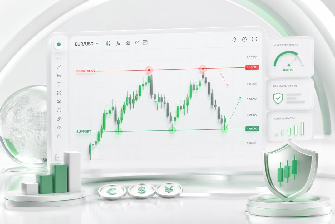
Support and Resistance — The Price Levels That Drive Markets
If there's one concept that every Forex trader needs to understand deeply, it's support and resistance. These are specific price levels where market dynamics consistently change.
Support Levels
Support is a price level where buying pressure exceeds selling pressure, causing price to bounce upward after touching it. Think of it as a floor. The more times a level has been respected, the stronger it becomes.
Resistance Levels
Resistance is the opposite — a price ceiling where sellers outnumber buyers. When price approaches resistance, selling pressure causes it to reverse downward. A level that was previously resistance often becomes support once price breaks above it, and vice versa.
- Always mark key support and resistance on your chart before trading
- Look for "confluence" — levels where multiple indicators align
- The more times a level is tested, the more significant the eventual break
- Use these levels to set logical stop-loss and take-profit orders
- Round numbers (1.2000, 1.3500) often act as natural psychological levels
Technical Indicators That Sharpen Your Chart Reading
While raw price action tells you a great deal on its own, technical indicators layer additional mathematical context onto your charts. Used correctly, they confirm trends, measure momentum, and identify potential reversal zones. Here are the most widely used ones in Forex trading.
Moving Averages (MA)
Moving averages smooth out price data to reveal the underlying trend direction. The 50-day and 200-day simple moving averages are among the most watched levels in Forex. When the 50-MA crosses above the 200-MA (the "golden cross"), it signals a potential bullish trend. The opposite — a "death cross" — signals bearish momentum.
Relative Strength Index (RSI)
RSI measures the speed and magnitude of price changes on a scale from 0 to 100. Readings above 70 suggest the pair may be overbought, while readings below 30 indicate it may be oversold. RSI is best used in conjunction with trend analysis rather than as a standalone signal.
MACD
The Moving Average Convergence Divergence indicator shows the relationship between two exponential moving averages. When the MACD line crosses above the signal line, it generates a buy signal; below generates a sell signal. The histogram provides a visual representation of momentum strength.
Don't overload your charts with dozens of indicators. Professional traders often use just two or three complementary tools — typically one trend indicator, one momentum oscillator, and price action context. More indicators often means more conflicting signals and slower decisions.
Your Forex Chart Questions, Answered
Still have questions? Here are the most common ones we hear from Forex traders at every level, along with straight, practical answers.
Candlestick charts are widely considered the best starting point for beginners and remain the preferred choice of professional traders. They display the same information as bar charts but in a far more visually intuitive format. The color-coded bodies (green for bullish, red for bearish) make it immediately obvious whether buyers or sellers dominated each period, and the rich library of named candlestick patterns gives you ready-made signals to look for.
Your timeframe should match your trading style and the amount of time you can dedicate to watching the markets. Scalpers who make dozens of trades per day work on 1-minute to 5-minute charts. Day traders typically use 15-minute to 1-hour charts. Swing traders use the 4-hour and daily charts. Position traders and investors focus on weekly and monthly views. Always check the next two higher timeframes to confirm your bias before placing a trade.
Chart patterns are reliable tools but not infallible predictions. Studies suggest well-known patterns like Head and Shoulders or Double Top have success rates in the 60–75% range when properly identified and traded with appropriate risk management. The key is confirming patterns with additional evidence — for example, using RSI divergence to confirm a Head and Shoulders, or waiting for a volume spike on a breakout to confirm a triangle. Never trade a pattern blindly; always use a logical stop-loss.
Support is a price level where buying interest is strong enough to prevent price from falling further — think of it as a floor. Resistance is the opposite: a price ceiling where selling pressure prevents further upward movement. The fascinating dynamic in Forex is that these levels often "flip" their role — a broken resistance level frequently becomes new support, and a broken support level often becomes resistance. This "role reversal" concept is one of the most powerful and practical ideas in all of technical analysis.
Many traders do trade primarily from charts (a purely technical approach), and it can absolutely be profitable. However, being completely unaware of the economic calendar is risky — major news events like central bank interest rate decisions, non-farm payroll reports, and GDP releases can cause massive, sudden price moves that override any chart setup. The best approach is to use charts as your primary trading tool while being aware of upcoming high-impact news events, either avoiding trades around those times or adjusting your position sizing accordingly.
Start Reading Charts — Start Trading Smarter
Reading Forex charts is a skill that pays dividends for the entire length of your trading career. Every chart tells a story — about market sentiment, supply and demand, trader psychology, and price momentum. The traders who take time to learn this language gain an insight that no automated system or copy-trade service can fully replicate.
You've now covered the essentials: the three chart types and when to use each, the key components of every chart, how to identify trends, the most common and reliable chart patterns, the meaning of support and resistance, and how indicators can complement your chart reading. That's a solid foundation.
Remember: consistent profitability in Forex is built on consistent process. Analyze before you act. Define your risk before you enter. And always combine your technical chart analysis with sound money management. Charts are your guide — not a guarantee.
The market rewards preparation and patience. Master the chart, manage your risk, and let probability work in your favour over time.
- Practice chart reading daily on a demo account — pattern recognition is a skill built through repetition
- Keep a trading journal noting what chart signals led to your trades and what happened after
- Start with one chart type, one timeframe, and one or two patterns before expanding your toolkit
- Always back-test your chart-reading strategy on historical data before risking real capital
- Visit fxTsignals.com regularly for expert chart analysis, live trade ideas, and educational resources
Elevate Your Forex Trading with Expert Chart Signals
Join thousands of traders who use fxTsignals.com to receive professional chart analysis, real-time trade setups, and market insights — delivered directly to you.